I’ve been meaning to start a devblog for a long time now, and I got motivated to do it after watching Masahiro Sakurai’s pretty damn good gamedev series. If the dude can make that on his spare time, I sure as hell don’t have a good excuse to postpone writing this.
With that said, since we’ve recently launched Horizon Chase 2 on Apple Arcade, that seemed like a good moment to talk a bit about one of my favourite topics and biggest challenge on that game: using product limitations to guide your project’s artstyle.
This first part will be more introductory, focused on discussing the concepts and effects on development.

The Many-Faced Budget
Art direction is a very organic process, especially in such an iterative media as games. It is a fine balance of exploring and achieving a unique creative vision for the project, all while fitting said vision within the bounds of your budget, that can come in a series of different factors:
Time and Funding
While these two points aren’t necessarily interchangeable, they have similar effects during production. A tight deadline or small funding for your project will require the team to be more careful with the scope of the game, as well as defining pipelines, tools and solutions that fit the team’s capabilities without demanding incredulous man-hours. On an art level, this can have significant impacts:
- Quicker iteration, especially on the pre-production phase. This means that visual prototyping and lookdev may be shortened, as the art team will have to rely more on simpler, streamlined ideas, possibly already battle-tested by the team members on other occasions. This doesn't mean that the team will have to follow on safe bets (after all, our goal is to make our games stand out and feel special), but it also requires...
- More commitment on decisions you may not be yet comfortable with. The longer it takes for a pipeline to be defined, or a prototype to be tested, the less time you'll have to actually build your systems and tools, and less time for polish in the end! It's important to understand when you need to investigate something further, and when it's time to keep moving forward with development.
- Asset Recycling, following the "make more with less" mindset. A single rock may be rotated, scaled, color-tinted and tweaked in several tiny different ways in order to allow the team to use it in different contexts, and create new compositions. While this may make decrease the uniqueness of that asset, it also give the team an ever-growing library of ready-to-use assets, while also allowing for unique assets to have some more extra crafting time.
A Case for Game Jams
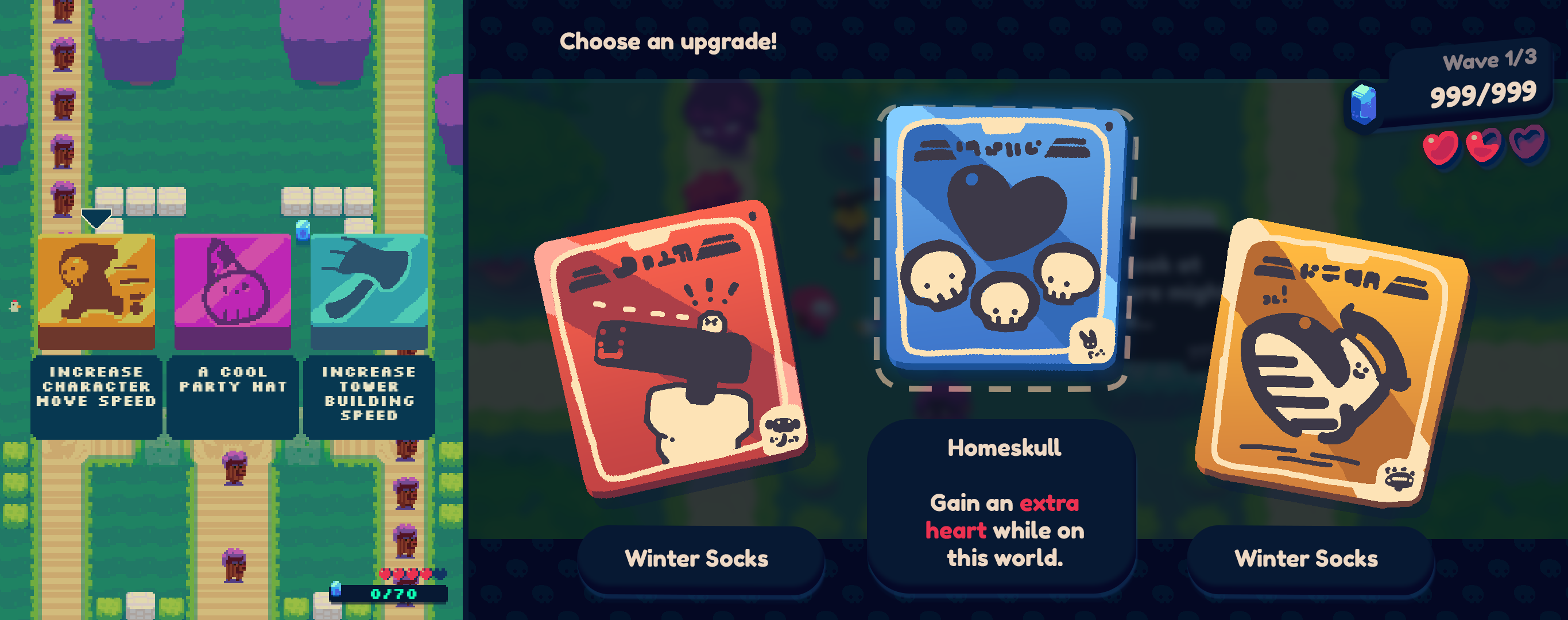
Game Jams are a great way of enforcing a limited scope and encouraging fresh solutions. On our GMTK entry, Towerbag, we completely threw sanity out of the window when we decided to add custom drawings for each player upgrade. A lot of time was sunk during production, and we weren't happy with the final results. When we decided to tackle a revamped version of the game, I took a step back and thought about what we originally had, and how we could combine design, tech and scalability all in one go.
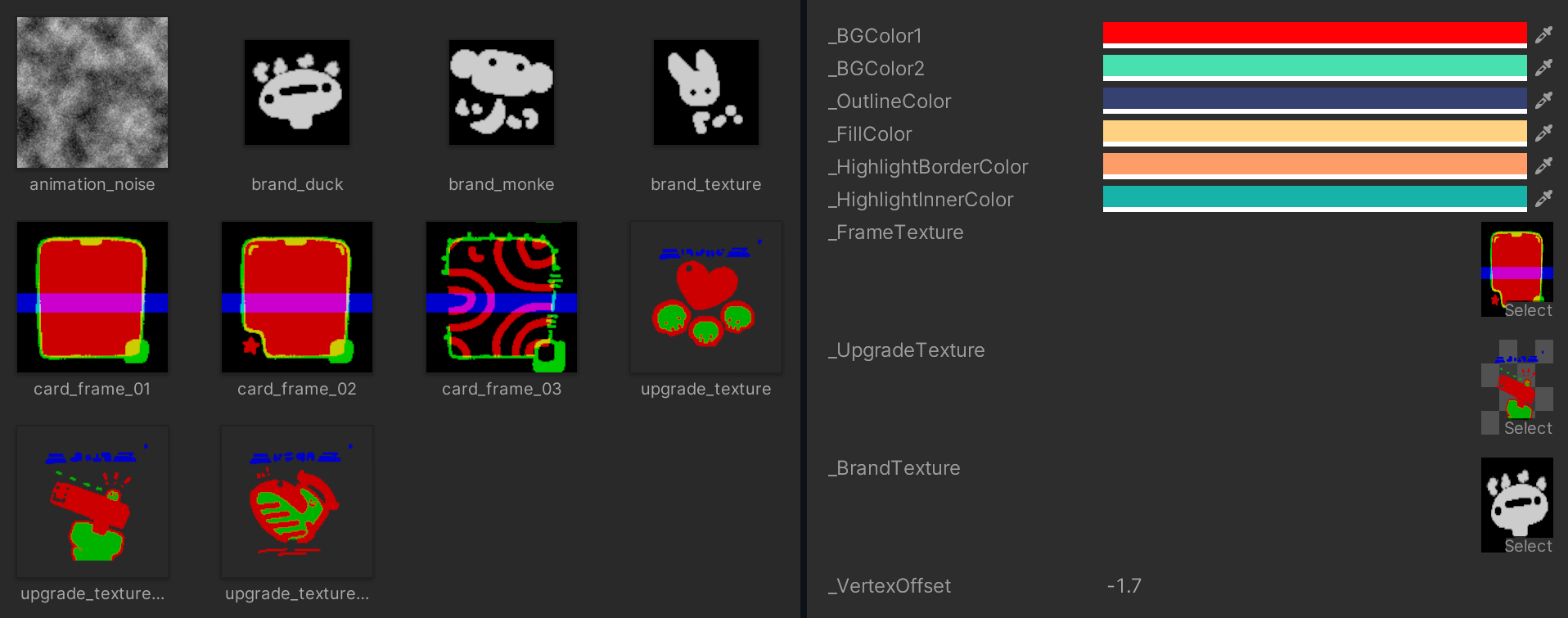
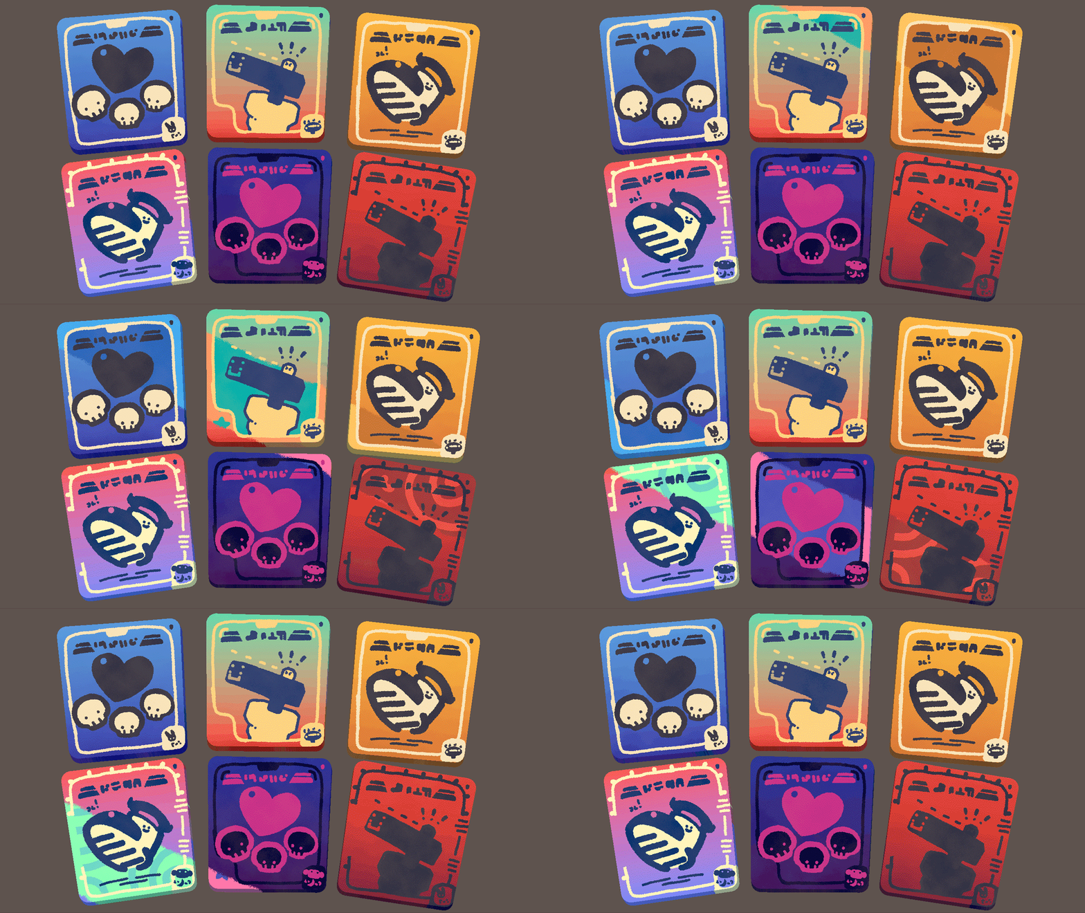
With that in mind, I thought the idea of making brands and encapsulating the visual identity of the cards onto different parts would fit nicely in a customizeable shader. From it, we started prototyping some ideas and see how would it fit into the art direction:


Technical Limitations
Once concepts and ideas start evolving and the team starts to create a mental image of the project, they’ll also wonder how to turn that into a reality. That, in turn, will brew many other questions. This is a natural part of game development, one that we as an industry have inherited with the advance of technology throughout the years.
- Understand the Technical Budget, as it will tell you how your project runs on the hardware, and how the hardware will run your project. It's a non-linear process to evolve the art in your game, exploit the strengths and avoid the weaknesses of the target device.
- Prioritize which parts of the game's visuals will require more processing power and by how much, so that areas that have a bigger impact on the visuals receive the correct amount of care and processing power. This may also impact the way certain assets are developed.
- Utilize the Gameplay Experience when structuring your technical decisions, as it will also have an impact on your rendering. It's a neverending rabbit hole of challenges, and it's important to walk hand in hand with Game Design and Art Direction in order to align expectations and develop a solution that works for all areas while fitting the creative vision of the product.
A Technical Legacy
During the advent of 3D graphics in videogames, developers were dealt with the challenge of discovering new rendering techniques and testing the waters of what was possible within a three-dimensional scene. Hardware was still severely limited, and with the combination of 3D models and textures, memory was a very scarce resource, and graphics followed a fixed-pipeline with no support for shaders and other effects.

Evolution of the medium
As hardwares evolve, certain techniques become available for developers to explore. This is especially interesting when you consider the other way around, as games used all sorts of smoke and mirrors to achieve a certain vision. On traditional IPs that had several entries over the years, the development team can utilize this as a way to showcase an evolution for the franchise, and give us a glimpse of new ideas and concepts that were previously impossible to be achieved due to said limitations. A good example of this is the Yakuza series, which had most of its games taking place in the Kamurocho district, which managed to keep a lot of its original structure intact over the years. As the idea of a big city with several light sources and pedestrians walking around, the RGG team chose certain technical and design limitations to work with the hardware.
Design Limitations
-
Achieving a vision for the game experience may also require limitations to be included as part of the Game Design. This can be typically seen in games where the visuals are directly tied in some way to the gameplay, as is the case of titles such as Monument Valley and Echochrome, where the game's camera perspective impacts on the player navigation and possible actions.

There are also other parts of the visuals that can be utilized in different ways to allow for new gameplay experiences. In The Unfinished Swan, for example, the developers utilized a dual-tone aesthetic in order to play with the idea of exploration through manipulation of positive and negative space.

Of course, I couldn't not mention the original Horizon Chase as an example of embracing said limitations. As a homage to retro 2D racers, the original team worked on the entire track system with the objective of replicating the infinite vanishing point usually seen in 2D racers such as Outrun or Top Gear. As such, the entire environment is a pseudo-3D scene, with objects actually moving and changing their scale to simulate a 2D-like perspective.

While other limitations may be imposed on the team, design limitations are purposefully embraced as a way to explore and evolve the interactive medium in other ways not previously seen. These will usually mean that the project is developed in an unorthodox manner, with unique tools and pipelines created for a specific purpose. As such, it can also mean that these limitations can actually make development more expensive, as it will take longer to train the team and may require more time on iterating such tools and may also need to be reworked if design pillars change on the project, which is more likely due to the unique nature of the project. While this is not inherently a bad thing, it requires a lot of caution and even better communication between different areas than usual.
And that’s it for now! On the next part, I’ll be talking a bit more in-depth about the sorts of limitations and challenges we had on developing Horizon Chase 2.